Wednesday, March 5, 2014
Glitzy Package Design
Once again, I have selected a piece of package design from the book Beauty & Healthcare: Package Design. The line of makeup and beauty products come from a company called B never too busy to be beautiful. Yes, I agree that is a very long company name. The blitzed containers appear to hold something very valuable and give off a European flare with its uniqueness. However, the product may appear to be European it is actually Indian. If I were in the makeup store (i.e. Sephora) I would definitely be drawn to this product and think to myself "Oo, sparkly! I'm gonna keep the container to put my treasures in it!".
Everyday is a Holiday Promotion
I always like to look through calendars and see what every month's picture is, so I can really appreciate a good calendar when I see one! I borrowed this book from my good ole pal Sidney, who has great taste in design, and it's called Fingerprint: The Art of Using Handmade Elements in Graphic Design, By Chen Design Associates. These artists created an illustration for every month to complete a set of 12 handmade letterpresses coasters. I really enjoy the theme of their characters and the dorky humor all of them express. Stated in Fingerprint, the artists favorite design is a three-legged rabbit for "Unlucky Day."
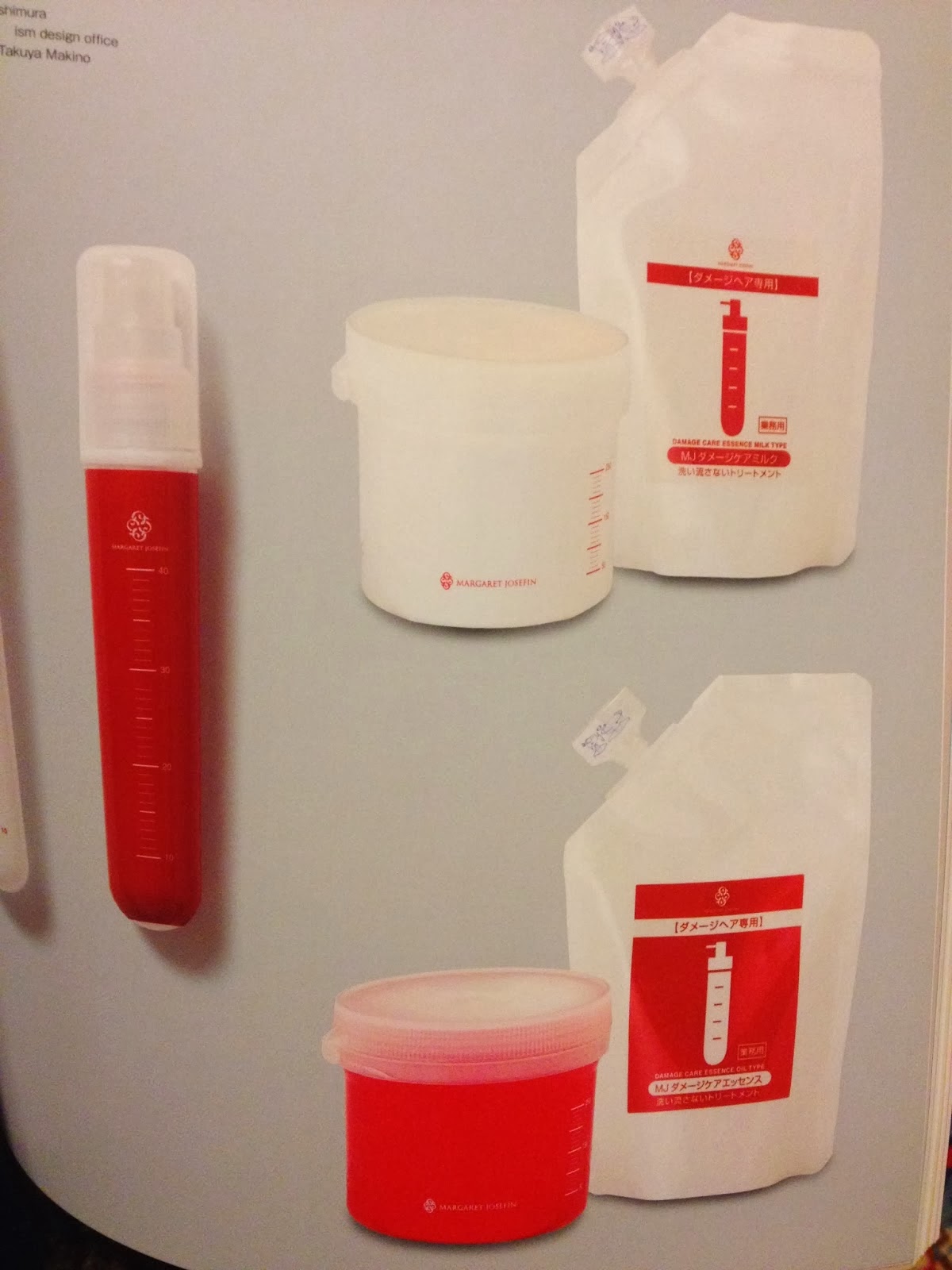
Blood Hair Care bag
This is something you don't see every day. The packaging for a hair care product really caught my eye. It is packaged as intensive hair care shampoo/conditioner. As in you need this. The product looks so formal I might even be afraid to use too much of it. If you haven't noticed, the package is designed to portray something along the lines of an IV bag. Which is kind of a big deal. In turn, this makes the contents of the bag appear hazardous. I found the item in Beauty & Healthcare: Package Design. The above design was created by Tahahito Nishimura, from Japan.
La Vie A Deux
This week's blog is about..you guessed it fashion! I pulled this piece from a book called By Hand: Handmade elements in graphic design. By Hand is an archive of pieces by various designers which include collages, illustrations, and typography, all pulled together by Pie Books. When looking over the illustrations there are minimal captions. In Japanese. Therefore I cannot declare exactly what each depicts only infer. However, I do know the above image is of a hand drawn dress by Akiko Matsumura. The reason I have two pictures is because I want you to note the detail she inhibited while drawing this dress. What attracted me to the above piece was the kind of embellishments she illustrated and how well it paints the paints the picture of what the apparel company sells. It is a one of a kind and very adorned.
Tuesday, February 11, 2014
HONESTtea
While at the gas station the other day, I discovered Honest Tea. Of their many flavors I chose honey green tea, and man was it seriously tasty! But what really drew my attention was the packaging, specifically the inner label. There was a great deal of thought put into the overall look and feel of the product, honey green tea. Their logo is a capital "T" with leaves set inside, or should I say word mark. If you peel away the label, on the inside reads the extra information, which gives room for the more important stuff the consumer see first on the outside. The inner label reads "Good timber does not grow with ease, the stronger the wind, the stronger the trees." Which to me is the perfect quote/rhyme to complete the packaging. Last but not least take note of the barcode the company manipulated. Can you see the trees?
Thursday, February 6, 2014
The Snooty Peacock
This is a logo design by Ryan Russell
Design, named The Snooty Peacock. It is a logo design for a fashion
company. What attracted me to the piece is the genius use of negative
and positive space. Reminds me of the Rorschach blot tests they give to
patients to see what image is seen first. Peacocks are a symbol of
fashion and high maintenance, just as the expression on the "Snooty's"
face. I came across the logo in a book found in our very own Parkland
Library. The book is full of nothing but illustrations and inspiration
with no words. The book is called GraphisLogoDesign Volume 8, put
together by Michael Schwab, however it is a collection from various
artists and design firms. If you would like to find this particular logo
is can be found on page 128.
Wednesday, January 22, 2014
DIY Flip-Flops
Starting this semester (for all my viewers keeping up) I will be posting and commenting on various ideas I have sketched from here on up. Without further adieu here it goes. This is an idea I saw on Pinterest. If your big into the whole do-it-yourself thing than you are probably more than familiar with all the money saving ideas people post to this website. this is a quick sketch of this idea for a pair of flip-flops. (Old Navy is well known for having them in every color, and usually 2 pairs for $5!) My sketch I have provided is a simple break down of about how much fabric is needed and some notes on which way to wrap the fabric. I think the idea is great and easy for just about anyone 5 and up. Something else to note that you could purchase really great fabric to contrast against the color of the flip-flops you decide!
Subscribe to:
Posts (Atom)