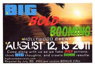
This right here is an example of terrible graphic design. There is even a blog about the above invitation claiming all the rules of design it breaks. First and most noticeably, there are way too many variations of type on the page. The words "Big, Bold, and Booming" do not have fonts that correctly represent each feeling of the word. Also, the picture in the background does not make me think Hollywood event, now that I look at the invite I'm not sure what event this is? The copy needs to be simplified and should be able to convey the important information such as who what and where, in a quick read. Finally I despise the color choice used. What prompted the designer pick three of the most basic colors to work with? I cannot believe the person wasted ink and paper on this garbage. I found this bad example on http://writemarketdesign.blogspot.com/2011/08/marketing-mishaps-using-too-many-fonts.html.

I like the way you write. Awesome, keep it up.
ReplyDeletePasadena Web Design
Graphic Designer Los Angeles
Web Design Los Angeles
seo services in los angeles
Hello admin! This is remarkable article as well as it is valuable for the entire person and I want to say that I would like to write on this subject too. You have an interesting written of this topic.
ReplyDeletemake stunning trifold brochure design
do classy vintage logo design | Fiverr
do stunning sport logo design | Fiverr
make amazing 3d logo design | Fiverr
do modern mascot logo design | Fiverr
Thank you for the post. I will definitely comeback. seo company los angeles
ReplyDelete