Wednesday, May 14, 2014

Setting a Bad Example

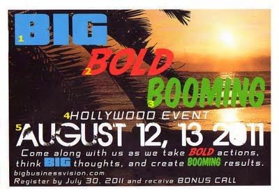
This right here is an example of terrible graphic design. There is even a blog about the above invitation claiming all the rules of design it breaks. First and most noticeably, there are way too many variations of type on the page. The words "Big, Bold, and Booming" do not have fonts that correctly represent each feeling of the word. Also, the picture in the background does not make me think Hollywood event, now that I look at the invite I'm not sure what event this is? The copy needs to be simplified and should be able to convey the important information such as who what and where, in a quick read. Finally I despise the color choice used. What prompted the designer pick three of the most basic colors to work with? I cannot believe the person wasted ink and paper on this garbage. I found this bad example on http://writemarketdesign.blogspot.com/2011/08/marketing-mishaps-using-too-many-fonts.html.

Birds in a Cage

I find this illustration very powerful and motivating. It keeps the viewer wondering "why?". The viewers eye is drawn first to the naked woman at the bottom of the page, then to the dress form then the hanger which is hanging on a bird's eye that is a cloud? The whole thing is very mysterious to me and I am still trying to make sense of it as I blog about it now. However, every time I glance back at it the idea of the birds being in a dress form which is supposed to represent a cage yet has an opening at the bottom is strangely beautiful to me. Rafal Olbinski's above illustration is depicted in the advertising section of the book 54th Annual of American Illustration.


Alaskan Totem Menu

The above is a vintage menu design made for Pacific Coast Steamship Company in 1911. The theme is supposed to connect to Alaska therefore the menu shape is a totem pole. The concept of the piece is interesting, at the bottom of the menu (on the inside) it says to fold on crease and stand upright. This makes it usefully symmetrical (vertically) as well as a decorative element on a table. What I also like about the menu is its indentations from the press it was printed on, better shown in the right image. Since there is a specific date on the bottom-"Friday, August 4th, 1911" it is safe to assume this menu was used once then thrown away. Which is a shame to me because it is such a beautiful design for its time and in color meaning it was most likely a pretty penny to print. I found this example in Menu Design In America by Jim Heimann.

Parco Spring

This is a design composed by a Japanese artist that I do not know much about quite honestly. However, I love the colors and images used within the poster. If I could I would hang this as a poster in my room (notice the peacock at the lower right hand corner). To me, the environment portrayed looks like something of an enchanted forest, because what normal one has flamingos climbing tree branches. The color pallette the artist used really sparked my attention, the teal blue, forest green, and light pink are not your average colors. Since my Design Principles class I have started to notice and appreciate how artists place items ever so carefully in a visual piece to make it appear random, even though he/she carefully picked each animal or foliage. In this case, I believe this principle applies. I found this piece in the book New Girly Graphics which is an archive of mostly Japanese design and in a different language. Fortunately, aesthetics can be adored without all the descriptions.

Tribal Book Cover

This is the book cover of 54th Annual of American Illustration, designed by Marcos Chin. For his design called Textile he won a gold medal. He was inspired by photos he saw in a book called Natural Fashion: Tribal Decoration from Africa by Hans Silvester. What I like about the book cover is the various designs of patterns used for the neck piece. Believe it or not this piece was hand crafted. It is a design that fits appropriately for the kind of book this is about which is illustration art.

Istanbul Culture

The above is a design by Kari Piippo as a poster project for International Istanbul Graphic Design Week. I chose this piece to blog about because I just vacationed to Turkey a couple of weeks ago. Upon my visit I stayed in Istanbul for a few days as well. I can say this poster design, entitled "Istanbul as felt by...", and Istanbul is perfectly represented here. The country is known for its wonderful textiles and textures of fabric are very rich. Also, Istanbul is the only city which is located on two different continents, being Asia and Europe. The pattern within the silhouetted man is a perfect match to the fabric I saw at the bazaar. Also, the deep blue color is represented everywhere in Istanbul, it is also the color of the evil eye. Which is a good luck charm everyone hangs in their rearview mirror. I found this example in the book Nordic Graphic Designers.

Maze Code

The above is a firm's foldout card celebrating Christmas and New 
Year's, designed by Nikolaus Schmidt Design in 2011.  The foldout design is a less traditional approach in comparison to a standard card. At first glance I thought what a great idea to use a maze as a design element! Not until I read further into the description article did I realize it spelled out the greeting "merry christmas and a happy new year". The idea of the coded message is unconventional and not your ordinary holiday card. In fact, white on a black page in this way looks futuristic. Nonetheless, in aesthetics and as inspiration the foldout succeeds. I found the design in the book Design/Paper. 

Future Under Crying Kids

The poster above is a photograph of a crying kid manipulated by the designer for a Tokyo exhibition in 1995. Seiju Toda, the designer, modified the picture in such a way to dramatize children's anxiety over their future. This is an example of bad design. The kid does not look anxious about his future, to me he is alien like and he might have laser eyes. Also, the name of the campaign is Future Under Crying Kids. Notice when the words are abbreviated it turns into...well you know. Something the designer probably did not even notice since the design firm is based in Asia. I found this piece in the publication On Edge: Breaking the Boundaries of Graphic Design By Karen D Fishler. 

Zimbabwean Trillion Dollar Flyer

The image above came from the publication The Best Advertising and Design in the World By D & AD Annual. That right there should tell ya this is a pretty genius design. In order to understand and appreciate why I chose this page out of the 589 pages in the whole book. Its a rather large book. Anyways, the paper notes was the form of "cash" in Zimbabwe until Mugabe made it worthless. Now, the Z$ trillion note has been turned into flyers by printing the campaign right onto it. Which the night before they did not even have the money to cover advertising charges. The powerful and supreme idea used Mugabe's own creation against him. 

Say it Loud

The above pieces are not from the same client, meaning all of the wardrobe pieces are not all the same brand. However, the theme is the same through out the whole collection- "Say it loud". What the photographer, Torkil Gudnason, wanted to portray was culturally loud and diverse pieces that viewers lust for. By using the vibrant colors and combining them together it says cool yet unusual. Gudnason decided to crop off pieces of a mannequin which is an interesting approach since most fashion ads use human models. The mood of the fashion ad says contemporary with its super enriched photography and bright backdrops with oversized white type. I found this publication in Vizz  Outrageous Visual Communication By Adrienne Weinfeld-Berg.

The Umbrella Girl

The Salt Umbrella Girl is recognized as Morton Salt's telegraphic metaphor since 1911. "When it rains it pours" has been their slogan just as long. This is the first time in history a product/brand was illustrated in such a way that describes its innovative benefit, which was the first salt mixture that allowed a smooth pour even in a humid environment. What attracts me to the retro illustration is its ability to be recognized and still in use for over 100 years! The design is clever and simply makes sense- a cheerful young girl who has a skip in her step and is celebrating Mr. Morton's bright idea. After he and the illustrator came up with the famous Umbrella Girl, Fedex, amazon, and I (heart) NY,  metaphors followed. I found this example of retro design in the book I Heart Design By Steven Heller.

Fun in the Sun

For this weeks blog post I found it very appropriate to elaborate on this design piece. If you did the homework last week this should look quite familiar to you. The style of the sun above is more modern, and playful, to me. The sun was designed by Alexander Girard for La Fonda del Sol Restaurant. Also, it seems as if the style is not quite a Mexican feel but multiple cultures in its identity. What appeals to me about the above design is that it has a hand crafted quality to it. Notice all of the rays are not the same shape and not evenly spaced. Girard's design represents optimism and still successfully demonstrate so without descending into chaos and disorder without confining strictly to modernism. I pulled this from I Heart Design By Steve Heller.

Animation

Here is something we probably are all familiar with and we can draw inspiration from: animated characters. What sparks my creative flow about these particular characters are the colors the animator uses. To me, this is what makes them really come alive. Just take a moment to think about what Pocahontas, Taz, Tweety, or even the Flintstones would like if they were in black in white. It would definitely not be the same. The artist who is responsible for the characters above is Tim Huhn. He is an animator who's work is represented in Workbook Illustration Volume 19.  

The National Art Collections Fund

The logo above (the heart collage) is a logo for The Art Fund which is a secret art collections in the United Kingdom whose objective is preserving various pieces of art. The collage represents all the different kinds of art ranging from sculpture, pottery, painting, music, clothing and others. The artists from JohnsonBanks firm collaborated and came up with a simple idea: a heart encompassing pictures of art and design pieces to demonstrate their love for art. Sometimes such a simple design can be dangerous territory for some designers because there is the chance that it will turn out cliche. However, in this case, I do not think that to be true at all. I think what draws me most to the logo is how they fit all the pieces inside to make the heart perfect. I came across this piece in the book Masters of Design Logos & Identity by Sean Adams.

Wednesday, March 5, 2014

London Campaign


Given that this piece of design is a full spread, this is the first one that caught my eye when I was flipping through the pages of Masters of Design Logo & Identity by Sean Adams. I love the use of positive and negative this creates. If you did not notice at first, quite like I did, the icons on the top mirror those on the bottom. This is a logo targeting global businesses communicating that they are the best place to host a company. Instead of only referring to one of their attractions (such as Big Ben) the campaign is combining forty-five. The overall shape is varied and probably took a very long amount of time to make the logo appear somewhat random. When I look at this I imagine a loud, diverse, community with fun activities to do. Almost like Disney World.

Glitzy Package Design


Once again, I have selected a piece of package design from the book Beauty & Healthcare: Package Design. The line of makeup and beauty products come from a company called B never too busy to be beautiful. Yes, I agree that is a very long company name. The blitzed containers appear to hold something very valuable and give off a European flare with its uniqueness. However, the product may appear to be European it is actually Indian. If I were in the makeup store (i.e. Sephora) I would definitely be drawn to this product and think to myself "Oo, sparkly! I'm gonna keep the container to put my treasures in it!".

Everyday is a Holiday Promotion


I always like to look through calendars and see what every month's picture is, so I can really appreciate a good calendar when I see one! I borrowed this book from my good ole pal Sidney, who has great taste in design, and it's called Fingerprint: The Art of Using Handmade Elements in Graphic Design, By Chen Design Associates. These artists created an illustration for every month to complete a set of 12 handmade letterpresses coasters. I really enjoy the theme of their characters and the dorky humor all of them express. Stated in Fingerprint, the artists favorite design is a three-legged rabbit for "Unlucky Day." 

Blood Hair Care bag


This is something you don't see every day. The packaging for a hair care product really caught my eye. It is packaged as intensive hair care shampoo/conditioner. As in you need this. The product looks so formal I might even be afraid to use too much of it. If you haven't noticed, the package is designed to portray something along the lines of an IV bag. Which is kind of a big deal. In turn, this makes the contents of the bag appear hazardous. I found the item in Beauty & Healthcare: Package Design. The above design was created by Tahahito Nishimura, from Japan.

La Vie A Deux


This week's blog is about..you guessed it fashion! I pulled this piece from a book called By Hand: Handmade elements in graphic design. By Hand is an archive of pieces by various designers which include collages, illustrations, and typography, all pulled together by Pie Books. When looking over the illustrations there are minimal captions. In Japanese. Therefore I cannot declare exactly what each depicts only infer. However, I do know the above image is of a hand drawn dress by Akiko Matsumura. The reason I have two pictures is because I want you to note the detail she inhibited while drawing this dress. What attracted me to the above piece was the kind of embellishments she illustrated and how well it paints the paints the picture of what the apparel company sells. It is a one of a kind and very adorned.

Tuesday, February 11, 2014

HONESTtea


While at the gas station the other day, I discovered Honest Tea. Of their many flavors I chose honey green tea, and man was it seriously tasty! But what really drew my attention was the packaging, specifically the inner label. There was a great deal of thought put into the overall look and feel of the product, honey green tea. Their logo is a capital "T" with leaves set inside, or should I say word mark. If you peel away the label, on the inside reads the extra information, which gives room for the more important stuff the consumer see first on the outside. The inner label reads "Good timber does not grow with ease, the stronger the wind, the stronger the trees." Which to me is the perfect quote/rhyme to complete the packaging. Last but not least take note of the barcode the company manipulated. Can you see the trees?


Thursday, February 6, 2014

The Snooty Peacock

 
This is a logo design by Ryan Russell Design, named The Snooty Peacock. It is a logo design for a fashion company. What attracted me to the piece is the genius use of negative and positive space. Reminds me of the Rorschach blot tests they give to patients to see what image is seen first. Peacocks are a symbol of fashion and high maintenance, just as the expression on the "Snooty's" face. I came across the logo in a book found in our very own Parkland Library. The book is full of nothing but illustrations and inspiration with no words. The book is called  GraphisLogoDesign Volume 8, put together by Michael Schwab, however it is a collection from various artists and design firms. If you would like to find this particular logo is can be found on page 128.

Wednesday, January 22, 2014

DIY Flip-Flops

Starting this semester (for all my viewers keeping up) I will be posting and commenting on various ideas I have sketched from here on up. Without further adieu here it goes. This is an idea I saw on Pinterest. If your big into the whole do-it-yourself thing than you are probably more than familiar with all the money saving ideas people post to this website. this is a quick sketch of this idea for a pair of flip-flops. (Old Navy is well known for having them in every color, and usually 2 pairs for $5!) My sketch I have provided is a simple break down of about how much fabric is needed and some notes on which way to wrap the fabric. I think the idea is great and easy for just about anyone 5 and up. Something else to note that you could purchase really great fabric to contrast against the color of the flip-flops you decide!